
Post by freezenerve on Oct 11, 2005 22:36:06 GMT -5
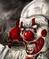
As soon as the readers lay eyes on the full color cover of Wicked Kanival 5, they know they are in for a treat. The green hag at the cauldron sets the tone for this issue—twisted fairy tales—and Rafal Hrynkiewicz’s illustration conveys the theme perfectly.
Between the glossy cover can be found something for everyone—interviews, articles, fiction—and first up is Jeff Strand’s retelling of the classic, “Three Little Pigs.” Jeff’s story is a wonderful way to open up the magazine as it emphasizes the magazine’s sub-title and keeping with the magazine’s feel, “Three Little Pigs” was never quite told this way.
New columns have been added in this issue. Found under The Sideshow of Superstition heading, the truth about fairy tales was finally revealed. Who knew that originally Cinderella’s evil stepsisters had their eyes pecked out by birds at the end of the story, or that the wicked queen tried to kill Snow White with something other than a poisoned apple? I found the article interesting and was disappointed when it ended. I wanted more. I wanted to know what really happened to Jack once he climbed that bean stock. I’m anxious to see what Scott Johnson has in store for us next time. Whatever it is, I’m sure we’ll all be enlightened.
Brett Blumfield’s column on the Ouija Board gave an interesting insight on the origins of a traditional board game and the myths that surrounds it. Is the Ouija really an instrument of the devil and a way to communicate with the dead? Blumfield has left that decision up to the reader. Well done, Brett!
As with previous issues, I found the contents well balanced and no one section dominated the other. The same can be said for the artwork that can be found throughout the magazine. Each illustration enhanced its assigned story. Each of the artists have their own distinct styles that compliments one and other and adds a diverse interest to the magazine.
Since I write fiction, I am naturally drawn to the fiction section of magazine first. I enjoyed all the stories, some more than others, but that’s not a bad thing. Everyone has different tastes and the variety of stories reflect those preferences. The illustrations create a sense of excitement and a kind of “I can’t wait” to read the story it depicts.
One thing I did notice was some of the stories had the first few words at the beginning bolded while other stories did not. For the sake of consistency, I think it would look better if all the stories began the same way. Personally, I like the bolded look.
Another change I’d like to see is with the color choice of the magazine’s title. The gray on gray sometimes makes it difficult to read. (It shows up better on the .pdf version as opposed to the print version)
Other than these too small issues, WK 5 is again a testament to the hard work, talent, and dedication by those who love the genre.
Keep it up!
Dave Greske
-----------------
I just finished reading my print edition of WK #5. It's getting better each time. I'm glad the carnival characters from WK #4 that introduced each section are gone. They were hokie. The magazine now has a more professional appearance.
The articles were original and informative - the best I've seen in any horror magazine. Others should do that. It helps writers like myself in research plus gives important background information for the casual reader.
I liked the increase of fiction. My favorite story was Liam Davies' "The Perpetual Commuter". This is a true horror story. It left me with an empty pit in the middle of my stomach.
I agree with the criticism about the little mistakes in the magazine - typos, title errors, etc. already given on this thread. I chalk it up to too many projects going at once. I would think that would go down with the finalization of Halloween issue and Raw Meat Anthology.
In conclusion I say keep up the good work.
Karen L. Newman
------------------
If you're interested here's where you can buy a hard copy or a .pdf
www.lulu.com/content/165558
